When it comes to editing portraits, mastering the art of color is essential. The right combination of hues can evoke emotions, set the mood, and create a cohesive and visually pleasing palette. In this blog article, we’ll explore the secrets to editing portraits with a harmonious palette that truly captivates the viewer. As a photo editor, you have the power to transform a simple portrait into a work of art. By understanding the basics of color theory and harnessing its emotional impact, you can elevate your portraits to a whole new level. So, get ready to add depth, meaning, and visual impact to your portraits as we uncover the secrets of color theory.
Color Theory Basics: Understanding the Emotional Impact of Hues in Portraits
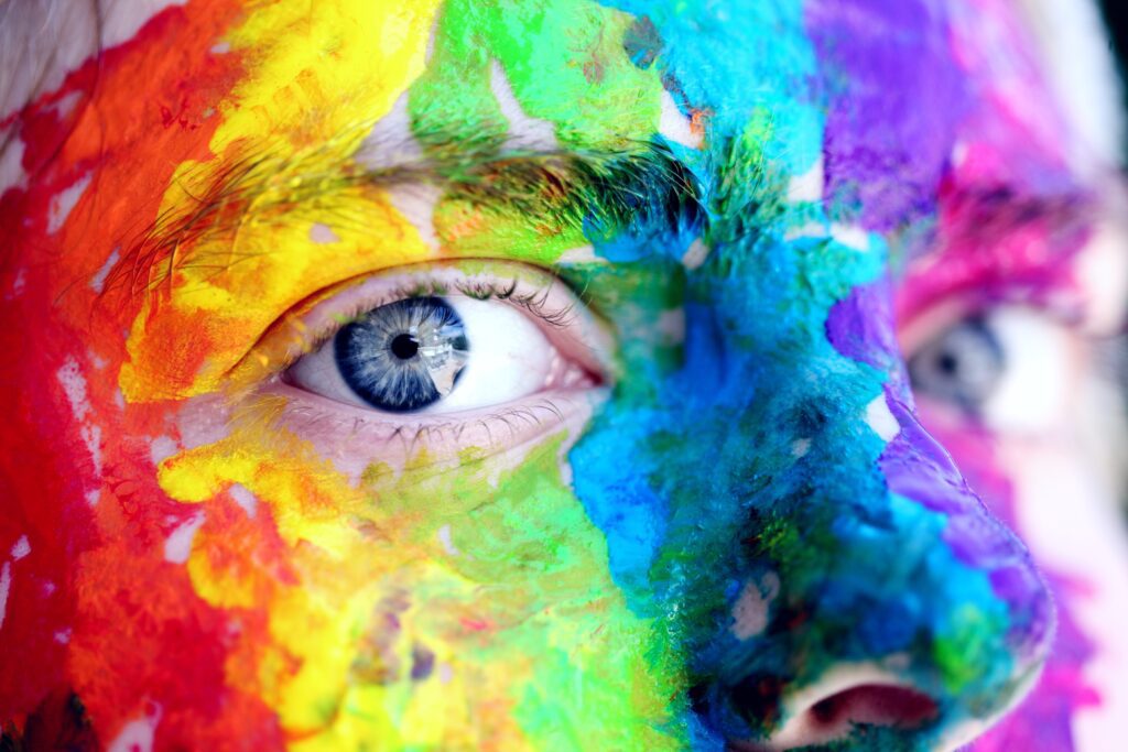

Understanding the basics of color theory is essential for any photo editor who wants to create impactful and visually appealing portraits. By harnessing the emotional impact of different hues, embracing contrast and harmony, and utilizing color grading techniques, you can elevate your portrait editing skills and create images that truly stand out.
The Language of Colors
Colors have a language of their own, and each hue carries a unique message. Warm tones like red and orange can convey energy, passion, and intensity. On the other hand, cool tones like blue and green evoke feelings of tranquility, calmness, and serenity. By understanding the emotional impact of different hues, you can strategically enhance the mood and story in your portraits.
Art of Editing Portraits: Embracing Contrast and Harmony
In portrait editing, it’s important to strike a balance between contrast and harmony. Contrasting colors, such as pairing warm and cool tones, can create visual interest and make certain elements pop in the photograph. On the other hand, harmonious colors that lie next to each other on the color wheel, like analogous colors, can create a sense of unity and coherence. By playing with contrast and harmony, you can guide the viewer’s eye and emphasize the desired focal points in your portraits.
The Power of Color Grading
Color grading is a powerful technique that allows you to manipulate the colors in your portraits to achieve a specific look or mood. By adjusting the saturation, brightness, and hue of different color channels while editing portraits, you can create a cohesive and harmonious palette that complements the subject’s characteristics and the overall theme of the photograph. Whether you want to create a warm and nostalgic atmosphere or a cool and futuristic vibe, color grading can help you achieve your desired aesthetic.
Color Grading: Enhancing Mood and Atmosphere Through Selective Editing
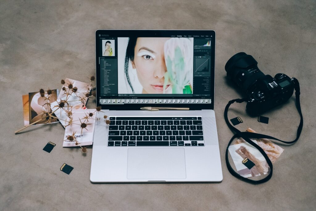

When it comes to editing portraits, color grading is a game-changer. This technique allows you to enhance the mood and atmosphere of your photos through selective editing. By manipulating the colors and tones, you can create a harmonious palette that complements your subject and brings your vision to life. So let’s explore the art of color grading and how it can take your portrait editing skills to the next level.
Setting the Mood with Warm and Cool Tones
One of the key aspects of color grading is using warm and cool tones strategically to enhance the mood in your portraits. Warm tones, like sunny yellows and fiery reds, can create a cozy and inviting atmosphere, perfect for portraits that exude warmth and friendliness. On the other hand, cool tones such as serene blues and calming greens can add a touch of tranquility and create a more ethereal ambiance. By playing with the balance between warm and cool hues, you can set the perfect mood that aligns with the subject and the desired message of your portrait.
Editing Portraits by Adding Depth with Color Contrast
Color contrast can bring a sense of depth and visual interest to your portraits. By selectively adjusting the saturation and brightness of different color channels, you can create a more dynamic and eye-catching composition. For example, you can make the subject stand out by boosting the saturation of their clothing against a desaturated background, or you can add drama by increasing the contrast between warm and cool tones. Color contrast not only adds visual appeal but also helps guide the viewer’s attention to the key elements in your portraits.
Achieving a Cohesive Look with Color Harmonization
To create a harmonious palette when you’re editing portraits, it’s essential to consider color harmonization. This technique involves adjusting the overall color balance and tonality of your photo to ensure a cohesive and pleasing aesthetic. By fine-tuning the white balance, adjusting the color temperature, and experimenting with color grading tools, you can achieve a consistent and harmonized look across your portraits. This not only enhances the visual appeal but also creates a sense of professionalism and coherence in your portfolio.
Color Harmony: Combining Tones for Cohesive and Pleasing Portraits
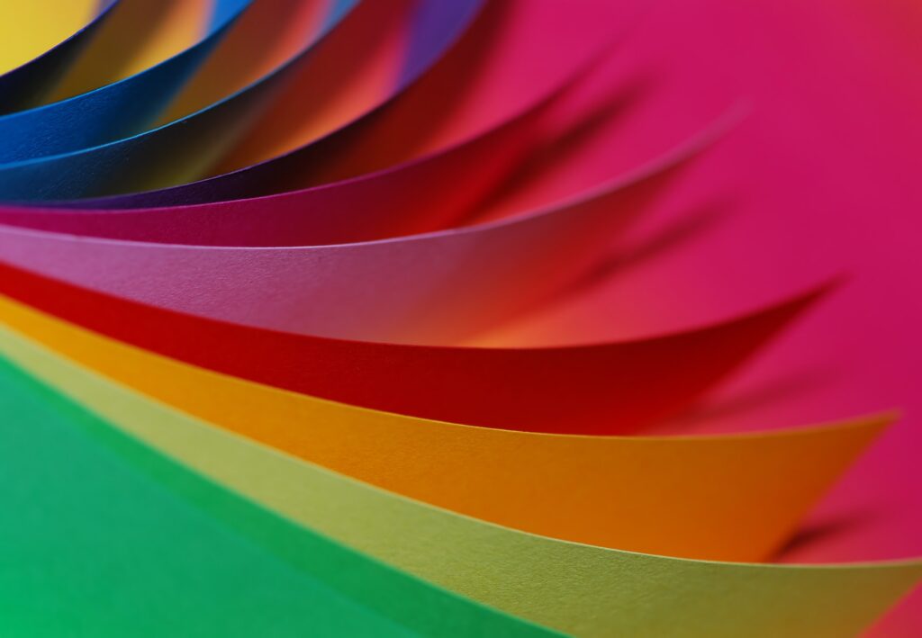

Creating a harmonious palette in your portrait editing is essential to achieve a cohesive and visually pleasing result. By combining tones strategically, you can enhance the overall aesthetic and make your portraits truly stand out. In this section, we’ll explore the art of color harmony and how it can transform your portraits into captivating works of art.
The Basics of Color Harmony
Color harmony involves the skillful combination of different tones to create a unified and balanced palette in your portraits. It’s important to understand the color wheel and how different hues interact with each other. Complementary colors, which are located opposite each other on the color wheel, can create a striking contrast when used together. Analogous colors, which are adjacent to each other, can create a harmonious and seamless blend. By experimenting with these color combinations, you can achieve a balanced and pleasing visual impact in your portraits.
Using Color Schemes to Enhance Portraits
Color schemes provide a framework for selecting and combining tones in your portraits. One popular color scheme is the monochromatic approach, where you use different shades and tints of a single color. This can create a cohesive look. Another option is the analogous color scheme, where you select colors that are next to each other on the color wheel. This creates a harmonious and soothing effect when it comes to the editing portraits. Triadic and tetradic color schemes offer more complexity by combining three or four colors that are evenly spaced on the color wheel. Experiment with different color schemes to find the one that best complements your subject and desired aesthetic.
What are Triadic and tetradic colors?
Paying Attention to Color Temperature
Color temperature refers to the perceived warmth or coolness of a color. Warm colors, such as red, orange, and yellow, create a sense of energy and vibrancy. Cool colors, like blue, green, and purple, evoke a calm and serene atmosphere. By considering the color temperature in your portraits, you can enhance the emotional impact and create a cohesive visual experience. For example, a warm-toned portrait might convey a sense of joy and passion, while a cool-toned portrait can evoke tranquility and introspection. Paying attention to color temperature adds depth and dimension to your portraits.
Color Splash: Adding Drama and Focus with Selective Color Editing
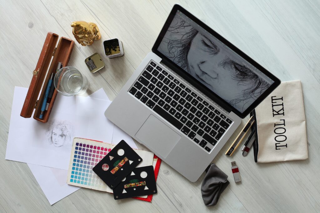

Selective color editing is a powerful technique that can add drama and focus to your portraits. By highlighting specific colors and desaturating the rest, you can create eye-catching images that grab the viewer’s attention. In this section, we’ll explore the art of color splash and how it can take your portrait editing skills to the next level.
The Impact of Selective Colors for Editing Portraits
Selective color editing allows you to create a striking visual impact by isolating specific colors in your portraits. By desaturating the background or other elements and leaving only certain colors intact, you can create a focal point that draws the viewer’s eye to the subject. This technique is particularly effective when you want to emphasize certain details or add a touch of creativity to your portraits. Whether it’s a vibrant red dress or a stunning bouquet of flowers, selective color editing can make it stand out in a powerful way.
Enhancing Drama and Emotion
Selective color editing can also be used to enhance the drama and emotion in your portraits. By isolating a particular color that carries a significant emotional impact, you can amplify the mood and create a more impactful image. For example, by desaturating the background and leaving the subject’s vibrant red lipstick intact, you can convey a sense of passion and intensity. The selective use of color can evoke strong emotions and make your portraits more engaging and memorable.
Maintaining Harmonious Color Relationships
While selective color editing adds a touch of drama, it’s important to maintain harmonious color relationships in your portraits. Ensure that the colors you choose to highlight are in harmony with the overall color palette of the image. Consider the color wheel and choose complementary or analogous colors to create a cohesive and visually pleasing result. By striking the right balance between the selectively colored elements and the rest of the composition, you can create a harmonious palette that enhances the impact of your portraits.
So editing portraits with a harmonious palette is an art that can truly elevate your work. By understanding color theory, embracing color grading techniques, achieving color harmony, and experimenting with selective color editing, you have the tools to create captivating and visually pleasing portraits. So, go ahead and unleash your creativity, infuse your portraits with emotion, and make them stand out from the crowd. Start editing your portraits with a harmonious palette and watch as your artistic vision comes to life.
If you have any inquiries, please put them in the comments section below. I’ll answer them in our upcoming blog post!
Colorful Editing Delights!


